Building a wafer map traditionally means collecting per-die result files from a directory tree, parsing die coordinates out of filenames or paths, and joining them into a grid. Here we read the single per-(die, radius) table emitted by notebook 4 and render it as a 2D grid of die cells coloured by FSR.
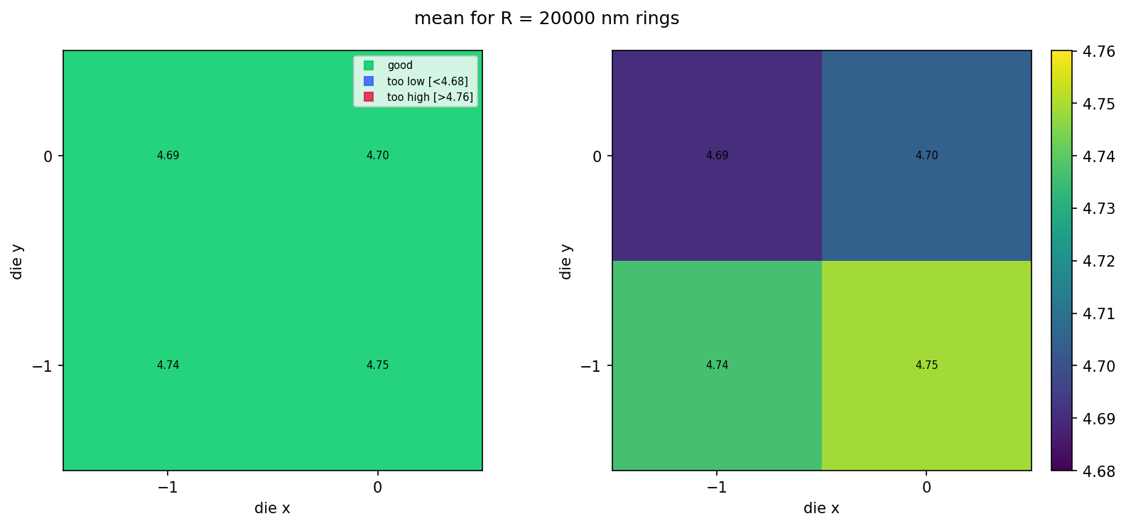
With a small live wafer (4 dies in this tutorial) the grid is just a 2×2 patch. With a populated wafer (the bundled sample dataset at the end of this notebook), the corner dies of a square reticle layout are absent from the table — they fall outside the wafer's circular boundary in the layout step — and the visible cells naturally trace out a wafer shape.
Setup
import getpass
import json
from pathlib import Path

import gfhub
import matplotlib.colors as mcolors
import matplotlib.pyplot as plt
import numpy as np
from gfhub import nodes
from PIL import Image
from tqdm.auto import tqdm

client = gfhub.Client()
user = getpass.getuser()
print(f"Running as user: {user}")
Running as user: runner
Defining the wafer map function
fsr_wafer_map takes the single die_radius_table.json from notebook 4, filters its rows to one ring radius, and renders a two-panel figure:
- Left panel: pass/fail map. Green for dies within spec, blue for too low, red for too high.
- Right panel: continuous colour scale showing the actual values, with a colorbar.
With a populated reticle layout (the bundled sample at the end of this notebook), the corner dies fall outside the wafer's circular boundary in the layout step and are simply absent from the table — the wafer-shape emerges from the data itself.
def fsr_wafer_map(
    table: Path,
    /,
    *,
    radius_nm: int = 20000,
    output_key: str = "mean",
    min_output: float = 0.0,
    max_output: float = 1.0,
    output_name: str = "wafer_map",
) -> Path:
    """Render a wafer-style map from the (die, radius) table JSON."""
    data = json.loads(table.read_text())
    rows = [r for r in data.get("rows", []) if r["radius_nm"] == radius_nm]
    if not rows:
        msg = f"No rows for radius_nm={radius_nm} in {table.name}"
        raise ValueError(msg)

    analyses = {(int(r["die_x"]), int(r["die_y"])): r[output_key] for r in rows}
    coords = np.array(sorted(analyses.keys()))
    die_xs = np.unique(coords[:, 0])
    die_ys = np.unique(coords[:, 1])
    x_min, x_max = int(die_xs.min()), int(die_xs.max())
    y_min, y_max = int(die_ys.min()), int(die_ys.max())
    nx = x_max - x_min + 1
    ny = y_max - y_min + 1

    x_edges = np.arange(nx + 1) + x_min - 0.5
    y_edges = np.arange(ny + 1) + y_min - 0.5
    X, Y = np.meshgrid(x_edges, y_edges, indexing="ij")

    data_grid = np.full((nx, ny), np.nan)
    for (x, y), value in analyses.items():
        data_grid[x - x_min, y - y_min] = value

    exists = ~np.isnan(data_grid)
    toolow = exists & (data_grid < min_output)
    toohigh = exists & (data_grid > max_output)
    good = exists & ~toolow & ~toohigh
    ones = np.ones((nx, ny))

    fig, (ax0, ax1) = plt.subplots(1, 2, figsize=(11, 5))

    ax0.pcolormesh(X, Y, np.ma.masked_where(~good, ones),
                   cmap=mcolors.ListedColormap(["#00cc66"]), vmin=0, vmax=1, alpha=0.85)
    ax0.pcolormesh(X, Y, np.ma.masked_where(~toolow, ones),
                   cmap=mcolors.ListedColormap(["#3060ff"]), vmin=0, vmax=1, alpha=0.85)
    ax0.pcolormesh(X, Y, np.ma.masked_where(~toohigh, ones),
                   cmap=mcolors.ListedColormap(["#dd2244"]), vmin=0, vmax=1, alpha=0.85)
    ax0.plot([], [], "s", c="#00cc66", alpha=0.85, label="good")
    ax0.plot([], [], "s", c="#3060ff", alpha=0.85, label=f"too low [<{min_output:.2f}]")
    ax0.plot([], [], "s", c="#dd2244", alpha=0.85, label=f"too high [>{max_output:.2f}]")
    ax0.legend(loc="upper right", fontsize=7)

    pcm = ax1.pcolormesh(X, Y, np.ma.masked_where(~exists, data_grid),
                         vmin=min_output, vmax=max_output)
    fig.colorbar(pcm, ax=ax1, fraction=0.046, pad=0.04)

    for ax in (ax0, ax1):
        for i in range(nx):
            for j in range(ny):
                v = data_grid[i, j]
                if not np.isnan(v):
                    ax.text(i + x_min, j + y_min, f"{v:.2f}",
                            ha="center", va="center", color="black", fontsize=7)
        ax.set_xticks(die_xs)
        ax.set_yticks(die_ys)
        ax.set_aspect("equal", adjustable="box")
        ax.set_xlabel("die x")
        ax.set_ylabel("die y")

    fig.suptitle(f"{output_key} for R = {radius_nm} nm rings")
    plt.tight_layout()

    output_path = table.parent / f"{output_name}.png"
    plt.savefig(output_path, bbox_inches="tight", dpi=150)
    plt.close()

    return output_path


func_def = gfhub.Function(
    fsr_wafer_map,
    dependencies={
        "json": "import json",
        "numpy": "import numpy as np",
        "matplotlib": [
            "import matplotlib.pyplot as plt",
            "import matplotlib.colors as mcolors",
        ],
    },
)
client.add_function(func_def)
print("fsr_wafer_map uploaded.")
fsr_wafer_map uploaded.
Creating the pipeline
The pipeline takes a single die_radius_table.json file ID and produces one wafer-map PNG. The spec limits (4.68 to 4.76 nm) match the expected FSR for R = 20 µm rings; adjust min_output / max_output if you change the target radius.
p = gfhub.Pipeline()

p.trigger = nodes.on_manual_trigger()
p.load_file = nodes.load()
p.load_tags = nodes.load_tags()
p += p.trigger >> p.load_file
p += p.trigger >> p.load_tags

p.aggregate = nodes.function(
    function="fsr_wafer_map",
    kwargs={
        "radius_nm": 20000,
        "output_key": "mean",
        "min_output": 4.68,
        "max_output": 4.76,
    },
)
p += p.load_file >> p.aggregate

p.save = nodes.save()
p += p.aggregate >> p.save[0]
p += p.load_tags >> p.save[1]

confirmation = client.add_pipeline(name="wafer_fsr_aggregation", schema=p)
print(f"Pipeline ready: {client.pipeline_url(confirmation['id'])}")
Pipeline ready: https://api.dev.gdsfactory.com/pipelines/019df3b6-8642-7131-8170-9209d5762b5a
Trigger the wafer map
Query the per-wafer table from notebook 4 and trigger the pipeline once per wafer. With one wafer in this tutorial, that's a single job.
tables = client.query_files(
    name="die_radius_table.json",
    tags=["project:tutorial_rings", user],
)
print(f"Found {len(tables)} per-wafer table(s)")

job_ids = []
for table in tqdm(tables):
    triggered = client.trigger_pipeline("wafer_fsr_aggregation", table["id"])
    job_ids.extend(triggered["job_ids"])

print(f"Triggered {len(job_ids)} wafer-map job(s)")
Found 1 per-wafer table(s)


  0%|          | 0/1 [00:00<?, ?it/s]


Triggered 1 wafer-map job(s)
jobs = client.wait_for_jobs(job_ids)
print(f"All jobs complete. Statuses: {set(j['status'] for j in jobs)}")
  0%|          | 0/1 [00:00<?, ?it/s]


All jobs complete. Statuses: {'success'}
View the live wafer map
With 4 dies on the live wafer (notebook 2 uploads a 2×2 layout), the grid is just a 2×2 patch. The next section shows what this looks like at production scale using a bundled sample.
wafer_maps = client.query_files(
    name="wafer_map.png",
    tags=["project:tutorial_rings", user],
)
print(f"Found {len(wafer_maps)} wafer maps")

for wm in wafer_maps:
    img = Image.open(client.download_file(wm["id"]))
    display(img)
Found 1 wafer maps
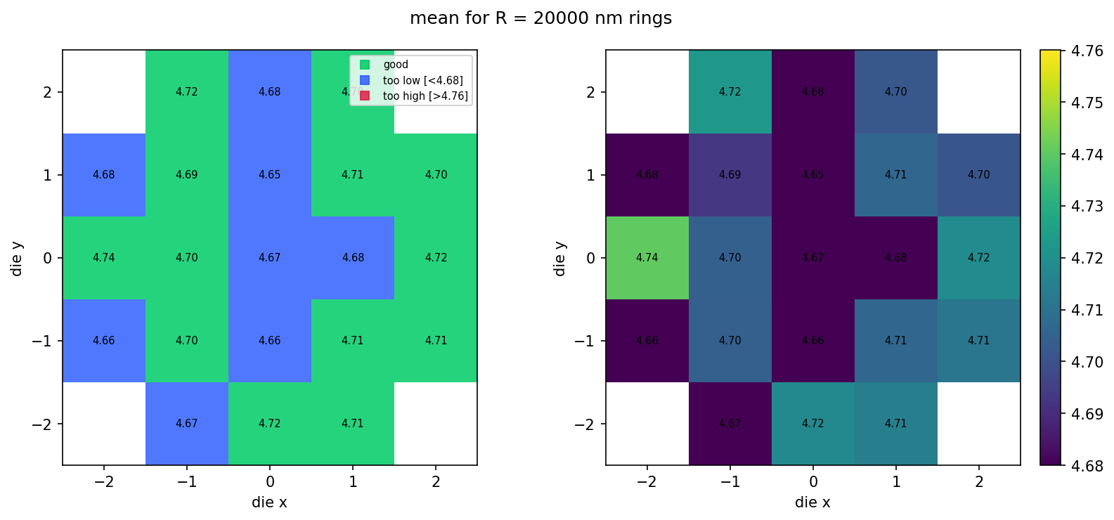
What it looks like at scale
The bundled sample_wafer_table.json is a deterministic snapshot of what the same pipeline would produce for a 5×5 die layout trimmed to a circular wafer (~21 dies × 3 radii). We render it locally with the same fsr_wafer_map function — no pipeline jobs, just file IO and matplotlib — so you can see the populated wafer look without spending CI time on the larger dataset. Regenerate this snapshot with python regen_sample_wafer.py if the simulation parameters or schema change.
sample_table_path = Path("sample_wafer_table.json").resolve()
cached_map_path = fsr_wafer_map(
    sample_table_path,
    radius_nm=20000,
    output_key="mean",
    min_output=4.68,
    max_output=4.76,
    output_name="wafer_map_cached",
)
display(Image.open(cached_map_path))