In the previous notebook we generated the cutback layout and uploaded it to DataLab along with a device table that records the position and component count of each structure on the chip.
In this notebook we:
- Load the device table from DataLab
- Define and upload a
plot_parquetfunction that generates a plot from any Parquet file - Create an automated pipeline that runs that function every time a measurement file is uploaded
- Generate simulated measurement spectra for each die and device, and upload them to DataLab
Once the pipeline is in place, every file upload will automatically produce a plot, this can be turned on/off in the web UI.
Setup
import getpass
import itertools
from contextlib import suppress
from pathlib import Path

import gfhub
import matplotlib.pyplot as plt
import numpy as np
import pandas as pd
from gfhub import nodes
from PIL import Image
from tqdm.notebook import tqdm

np.random.seed(42)  # fix the seed so the generated data is always the same
client = gfhub.Client()
user = getpass.getuser()
print(f"Running as user: {user}")
Running as user: runner
Load the device table
The device table was uploaded in the previous notebook. We retrieve it from DataLab by querying for its filename and tags, then read it directly from the downloaded stream into a DataFrame.
Tip: The newest() method handles the case where multiple versions of the file exist or multiple files are returned by the query, it picks the most recently uploaded one.
device_table_file = client.query_files(
    name="cutback_device_table_example.csv", tags=["project:tutorial_cutback", user]
).newest()
device_table = pd.read_csv(client.download_file(device_table_file.id))
device_table
| cell | x | y | components | |
|---|---|---|---|---|
| 0 | loss_2db | 33.835 | 116.310 | 816 |
| 1 | loss_1db | 529.485 | 116.310 | 400 |
| 2 | loss_0db | 516.910 | 714.861 | 16 |
Simulating the measurement spectra
Since we do not have real measurement data available for this tutorial, we generate synthetic spectra that mimic what you would typically record on a swept-source optical measurement bench.
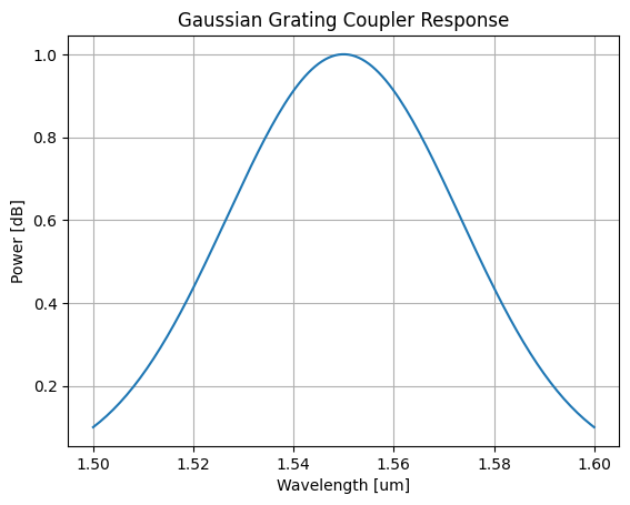
The layout we generated uses grating couplers for fiber-to-chip coupling. Grating couplers have a wavelength-dependent transmission that is well approximated by a Gaussian envelope, centered around their design wavelength and characterised by a 1 dB bandwidth. This spectral envelope is a property of the coupler design specifically. It should not be taken as a general statement about all coupling methods or all photonic measurements.
In our simplified model, the total recorded power at each wavelength is the product of this coupling envelope and a flat device loss that scales with the number of MMI components. Noise is added to make the data look more realistic.
def gaussian_grating_coupler_response(
    peak_power, center_wavelength, bandwidth_1dB, wavelength
):
    """Return the power of a Gaussian grating coupler response at a given wavelength.

    Args:
        peak_power: Peak transmission of the coupler.
        center_wavelength: Design wavelength of the coupler, in microns.
        bandwidth_1dB: 1 dB bandwidth of the coupler, in microns.
        wavelength: Wavelength at which to evaluate the response, in microns.
    """
    # Convert 1 dB bandwidth to Gaussian standard deviation
    sigma = bandwidth_1dB / (2 * np.sqrt(2 * np.log(10)))
    return peak_power * np.exp(-0.5 * ((wavelength - center_wavelength) / sigma) ** 2)
Let's visualise what a single coupler response looks like before we generate the full measurement sweep:
peak_power = 1.0
center_wavelength = 1.550  # um
bandwidth_1dB = 0.100  # um

wls = np.linspace(center_wavelength - 0.05, center_wavelength + 0.05, 150)

df_example = pd.DataFrame({
    "wl [um]": wls,
    "power [dB]": gaussian_grating_coupler_response(
        peak_power, center_wavelength, bandwidth_1dB, wls
    ),
})

plt.plot(df_example["wl [um]"], df_example["power [dB]"])
plt.title("Gaussian Grating Coupler Response")
plt.xlabel("Wavelength [um]")
plt.ylabel("Power [dB]")
plt.grid(True)
plt.show()
Defining the plot_parquet function
We want every measurement file we upload to automatically get a plot. To do this, we define a DataLab function that reads a Parquet file and saves a plot of two of its columns as a PNG.
Remember the rules explained in tutorial 3: positional-only Path inputs, keyword-only configuration parameters, and a Path return value. Once uploaded, this function can be wired into a pipeline that triggers on file upload.
We test it locally with .eval() before uploading to make sure it works correctly.
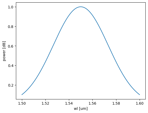
def plot_parquet(path: Path, /, *, x: str, y: str) -> Path:
    """Plot two columns of a Parquet file and save the result as a PNG."""
    df = pd.read_parquet(path)
    plt.plot(df[x], df[y])
    plt.xlabel(x)
    plt.ylabel(y)
    outpath = path.with_suffix(".png")
    plt.savefig(outpath, bbox_inches="tight")
    return outpath


func_def = gfhub.Function(
    plot_parquet,
    dependencies={
        "pandas[pyarrow]": "import pandas as pd",
        "matplotlib": "import matplotlib.pyplot as plt",
    },
)
# Test the function locally before uploading
temp_path = Path("temp.parquet").resolve()
df_example.to_parquet(temp_path)

result = func_def.eval(temp_path, x="wl [um]", y="power [dB]")
print(result)  # {"success": True, "output": "/path/to/temp.png"}

Image.open(result["output"])
{'success': True, 'output': PosixPath('/home/runner/work/DataLab/DataLab/crates/sdk/examples/cutback/temp.png')}
Function uploaded.
Creating the pipeline
A function on its own does nothing. It needs to be wired into a pipeline to run automatically. We build the pipeline explicitly using gfhub.Pipeline and the node helpers from gfhub.nodes, following the same pattern as in the pipeline tutorial.
This pipeline triggers on any .parquet file tagged with project:tutorial_cutback and your username. When it fires, it loads the file, runs plot_parquet with the configured column names, and saves the resulting PNG back to DataLab. The load_tags node carries the original file's tags through to the output, so the plot file inherits the same provenance tags as the measurement file it came from.
The auto-trigger means a plot is generated for every new file the moment it lands in DataLab, not when someone remembers to run the visualization script. The function runs server-side from the registered definition, so it produces the same result regardless of who uploaded the file or from which machine.
p = gfhub.Pipeline()

# Trigger on upload of a matching .parquet file, or manually on demand
p.auto_trigger = nodes.on_file_upload(tags=[".parquet", "project:tutorial_cutback", user])
p.manual_trigger = nodes.on_manual_trigger()

# Load the file content and its tags
p.load = nodes.load()
p.load_tags = nodes.load_tags()

# Run plot_parquet with the measurement column names
p.plot = nodes.function(function="plot_parquet", kwargs={"x": "wl [um]", "y": "power [dB]"})

# Save the output PNG, passing the original tags through
p.save = nodes.save()

# Connect triggers to load nodes
p += p.auto_trigger >> p.load
p += p.manual_trigger >> p.load
p += p.auto_trigger >> p.load_tags
p += p.manual_trigger >> p.load_tags

# Connect the processing chain
p += p.load >> p.plot
p += p.plot >> p.save[0]
p += p.load_tags >> p.save[1]

confirmation = client.add_pipeline("plot_parquet_tutorial", p)
print(f"Pipeline ready: {client.pipeline_url(confirmation['id'])}")
Pipeline ready: https://api.dev.gdsfactory.com/pipelines/019df3b5-7b8d-7860-aa7b-e143e8cd3452
Clean up existing measurement files (optional)
If you have run this notebook before, delete any previously uploaded measurement files so you start fresh. The GDS and device table uploaded in notebook 1 are preserved.
existing_files = client.query_files(tags=["project:tutorial_cutback", user])

# Keep the layout and device table from notebook 1
keep = {"cutback_device_table_example.csv", "cutback_example.gds"}
to_delete = [f for f in existing_files if f["original_name"] not in keep]

for file in tqdm(to_delete):
    with suppress(RuntimeError):
        client.delete_file(file["id"])
0%| | 0/33 [00:00<?, ?it/s]
Generating and uploading measurement spectra
We generate one simulated spectrum per combination of wafer, die, and cutback structure. In a real experiment these files would come directly from your measurement setup. For this tutorial, we compute them using the model defined above.
In this simulation, the total loss has three contributions:
- Coupling loss: a fixed 3 dB per grating coupler. Each measurement path goes through two couplers (input and output), so this contributes 6 dB in total.
- Device loss: a per-MMI insertion loss multiplied by the number of components in the structure.
- Noise: a small random variation applied to both the total loss and the per-wavelength power.
We simulate a 4x4 wafer map with the corner dies removed. Each uploaded file is tagged with the wafer ID, die coordinates, cell name, device position, temperature, and component count. The tags set here are what make the file queryable without parsing its name: any later analysis can call query_files(tags=["die:0,0", "components:16"]) and get exactly the right files, without knowing or caring what the files are called or where they were saved. A filename convention would carry the same information in principle, but it only works if everyone follows it consistently and no one ever renames a file.
wafer_id = "wafer_tutorial"
wafers = [wafer_id]

# Define a 2x2 wafer map for debugging
dies = [
    {"x": x, "y": y}
    for y in range(-1, 1)
    for x in range(-1, 1)
]
grating_coupler_loss_dB = 3
device_loss_dB = 0.1
noise_peak_to_peak_dB = device_loss_dB / 10
device_loss_noise_dB = device_loss_dB / 10 * 2

for wafer, die, row in tqdm(
    list(itertools.product(wafers, dies, device_table.to_numpy()))
):
    die_str = f"{die['x']},{die['y']}"
    cell, dev_x, dev_y, components = row
    device = f"{dev_x},{dev_y}"
    T = 25.0

    # Compute total loss: two couplers plus device loss scaled by component count
    loss_dB = 2 * grating_coupler_loss_dB + components * (
        device_loss_dB + device_loss_noise_dB * np.random.rand()
    )
    peak_power = 10 ** (-loss_dB / 10)

    # Apply grating coupler spectral shape and add per-wavelength noise
    output_power = gaussian_grating_coupler_response(
        peak_power, center_wavelength, bandwidth_1dB, wls
    )
    output_power = np.array(output_power)
    output_power *= 10 ** (noise_peak_to_peak_dB * np.random.rand(wls.shape[0]) / 10)
    output_power = 10 * np.log10(output_power)

    df = pd.DataFrame({"wl [um]": wls, "power [dB]": output_power})

    client.add_file(
        df,
        filename=f"cutback_device_{components}.parquet",
        tags=[
            user,
            "project:tutorial_cutback",
            f"wafer:{wafer}",
            f"die:{die_str}",
            f"cell:{cell}",
            f"device:{device}",
            f"T:{T}",
            f"components:{components}",
        ],
    )
0%| | 0/12 [00:00<?, ?it/s]
What's next?
You have now uploaded a full sweep of simulated measurement spectra, one file per die and device. Each file is tagged with its full provenance: wafer, die, cell, and component count, which is exactly what the analysis pipelines will need.
The pipeline running in the background will generate a plot for each uploaded file automatically. In the next notebook, we load those measurements and perform the per-die cutback fit to extract the insertion loss per MMI.